blog.rowlisonart.com
  • Home
  • Main Site
  • Contact
  • Home
  • Main Site
  • Contact

#79 A NEW LOOK

2/1/2018

0 Comments

 
Since starting my freelance business I’ve never really been happy with the name ROWLISON GRAPHIC DESIGN. I chose it because it made it easy to understand the services I offer. The problem with the name and visual identity is that;
  • It didn’t set me apart
  • It was cliche
  • It wasn’t creative
CREATIVE is the word that now communicates the services I offer. It's the perfect word because it encapsulates graphic design without actually saying graphic design.
Picture

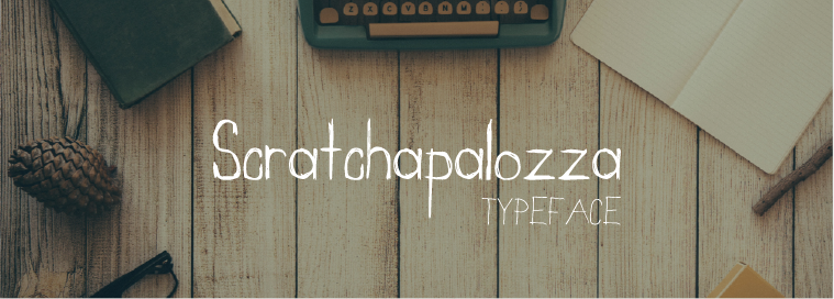
Download Scratchapalozza for personal and commercial use.

​My new visual identity:
  • is unique
  • sets me apart
  • has a hand crafted look
I simplified the logos typographically getting rid of Lato and sticking to one typeface. The typeface Scratchapalozza was actually created by yours truly. Now my brand identity has the unique hand crafted look I offer my clients. ​
0 Comments


Leave a Reply.

    Picture

    ARCHIVES

    October 2018
    June 2018
    February 2018
    January 2018
    November 2017
    October 2017
    September 2017
    August 2017
    July 2017
    June 2017
    May 2017
    April 2017
    March 2017
    February 2017
    January 2017
    December 2016
    November 2016
    October 2016
    September 2016
    July 2016
    May 2016
    April 2016
    March 2016
    February 2016
    January 2016
    December 2015
    November 2015
    October 2015
    August 2015
    July 2015
    May 2015
    April 2015

    AUTHOR

    Brad Rowlison
    Graphic Designer &
    ​Hand Letter

Powered by Create your own unique website with customizable templates.