|
As stated in my previous post logos were on the menu for Type II this week. The assignment was too create a logo for the city of Portland. A simple logo that was unique, could be scaled, and captured the culture of the city. In class we brain stormed a fairly large list of words that represented Portland's culture. Words like coffee, beer, roses, trailblazers, bridges, hood, hip, environment, shoes, and so on and so forth. 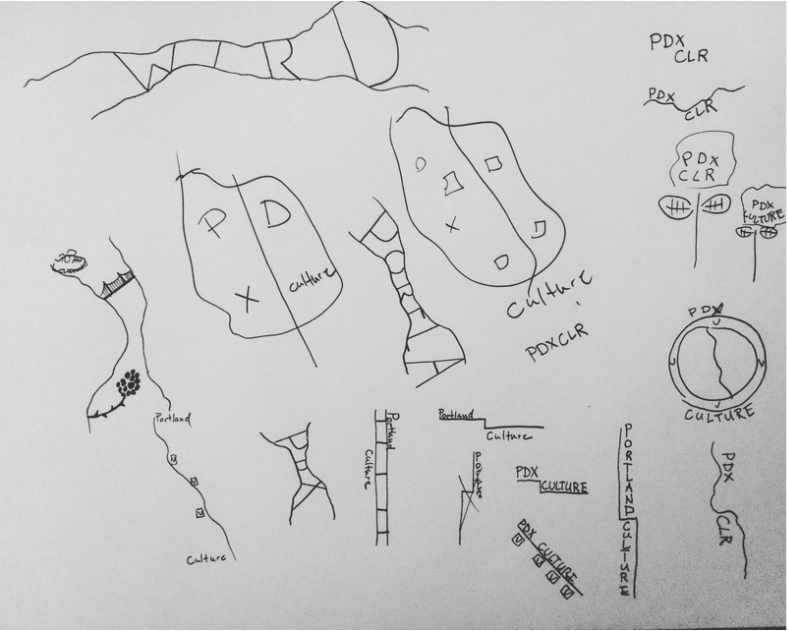 These were some early sketches . After doing a few I took the ideas into Illustrator. My original intent was to focus on the Willamette. It was going to be the river with icons in it representing the most important and unique culture of Portland. 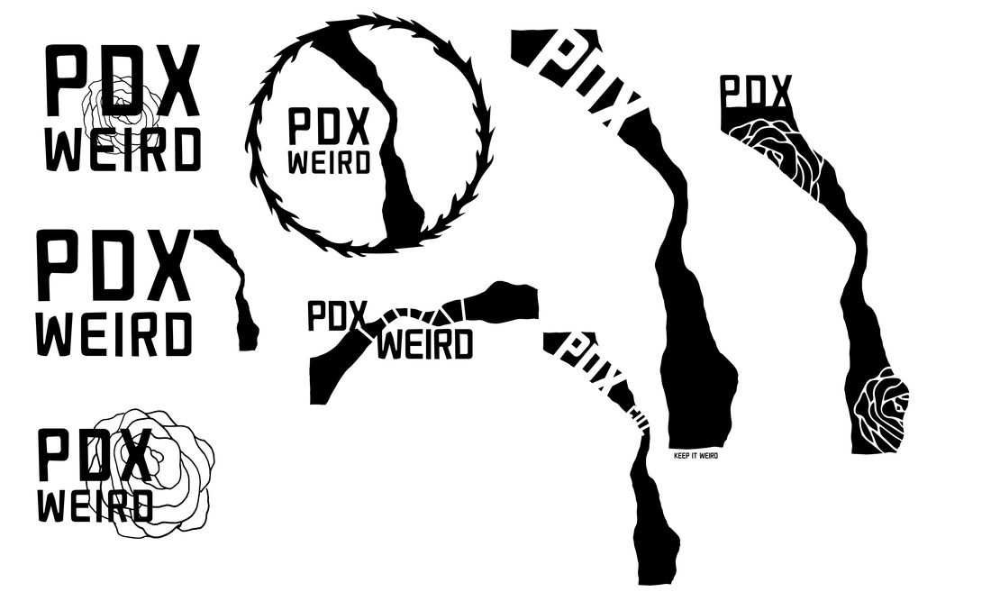 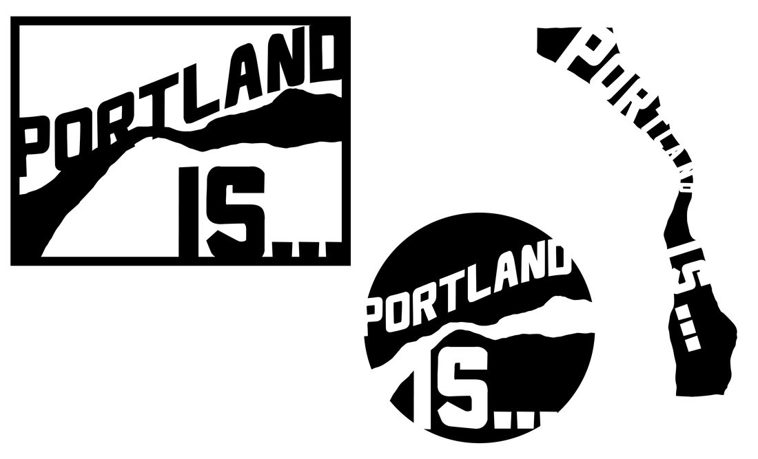 I played around a little with the WEIRD idea; however, I thought that that has been over used so I moved on. I had trouble deciding what cultural points to focus on. Portland has to much culture to represent with just a few icons. This problem lead me to the Idea of PORTLAND JUST IS. That way you can just fill in the blank of what Portland is; but I wasn't quit sold on the idea, and the river kept creeping back into my thoughts. Like many cities Portland lies on a river. In years past and still today rives are a source of transportation, food and many other things. They allow the movement of people and goods. They are the heart of cities. The Willamette and its uniqueness ( deep water and connection to the ocean via the Columbia ) allowed Portland's industry to thrive and in turn allowed the city to prosper. All of this lead me to the conclusion that the city and all of its vibrant cultures origins lie in the river. These are some designs I'm working on with the river being the hero representing the root of Portland's culture. 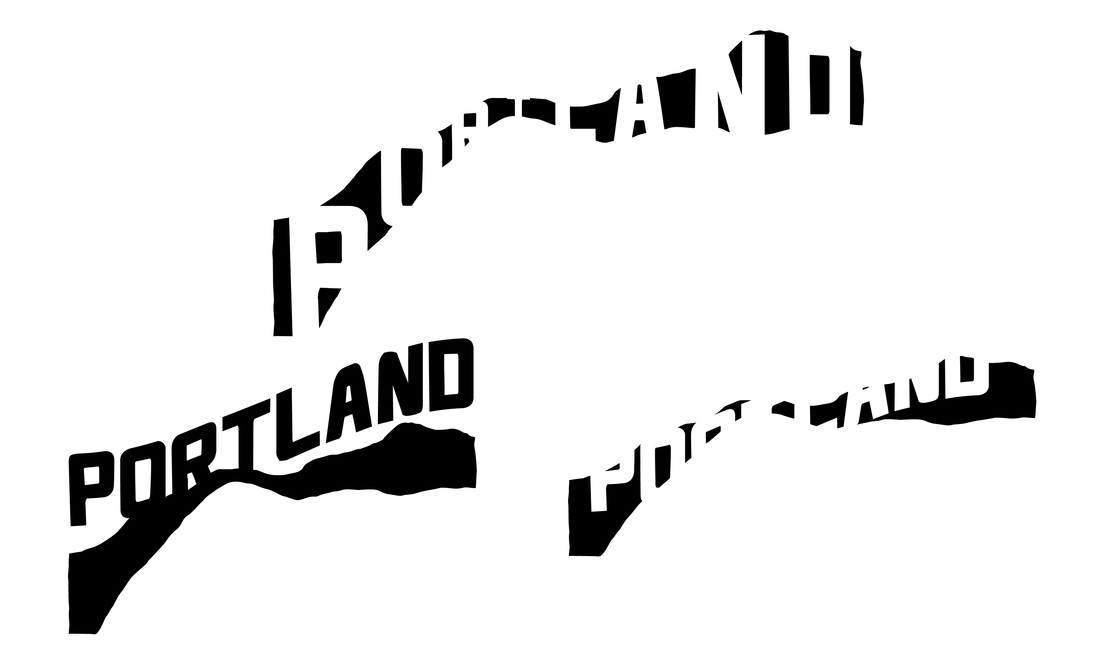
0 Comments
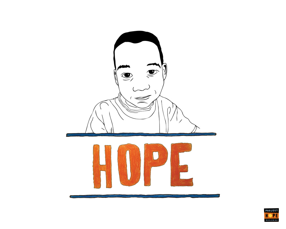
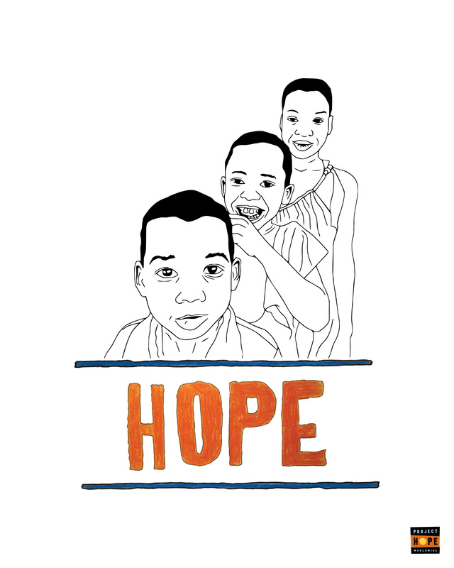
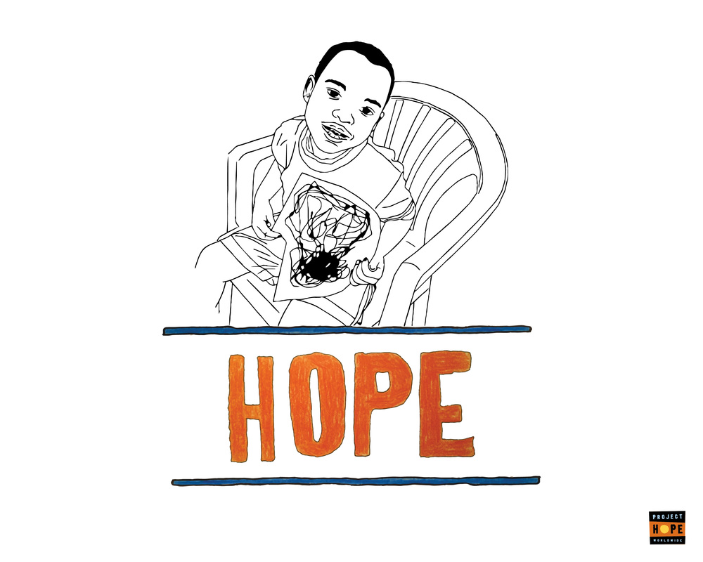
Logos are on the menu for this week in Type II. This was an interesting quick video about the important aspects of a logo. After taking some feedback from my instructor I made some changes to my HOPE advertisement. The design now more clearly expresses the mission of the non-profit. It still may need a few tweaks like a tag line. 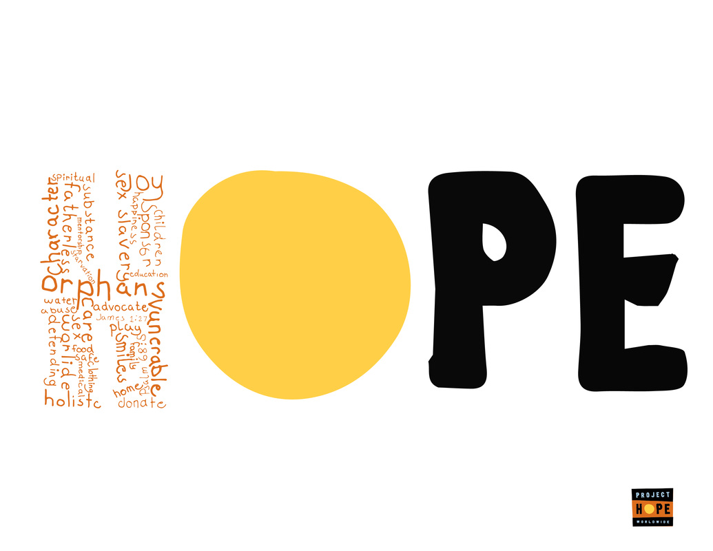 Type II Assignment 3:
   Last night's in class Type II assignment was to use the word CANDIDATE and create a type design that expressed that word. I went they easy route and made fun of Trump's comb over. 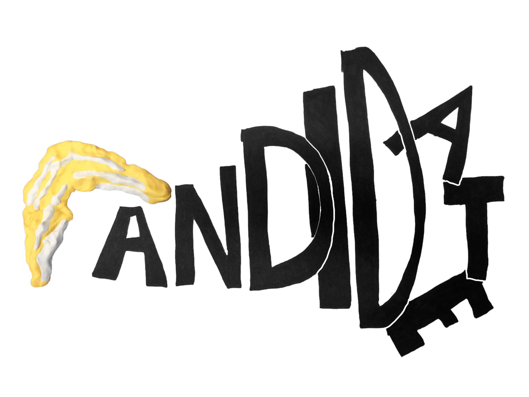 |

ARCHIVES
October 2018
AUTHORBrad Rowlison |

