|
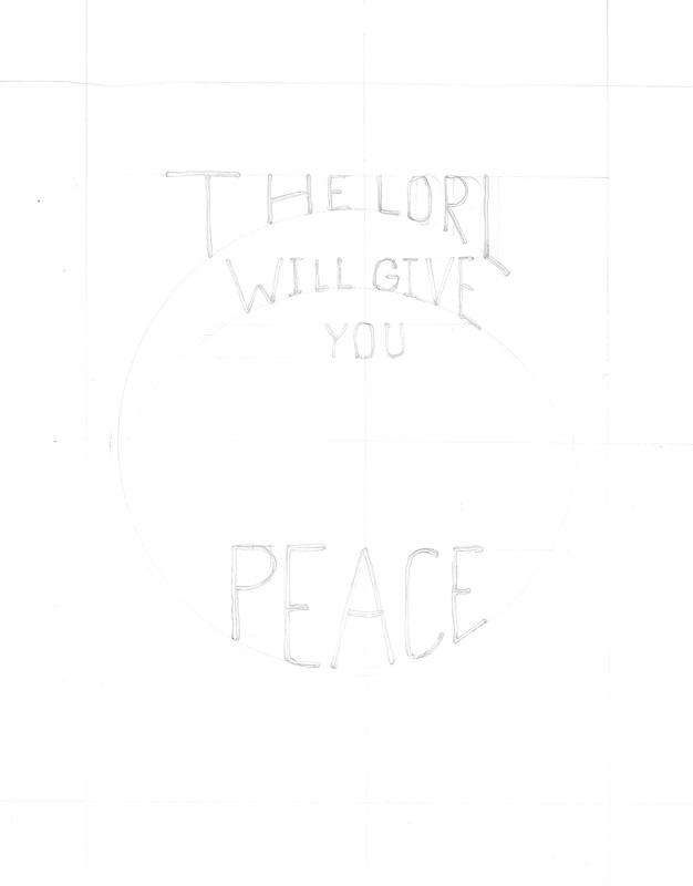
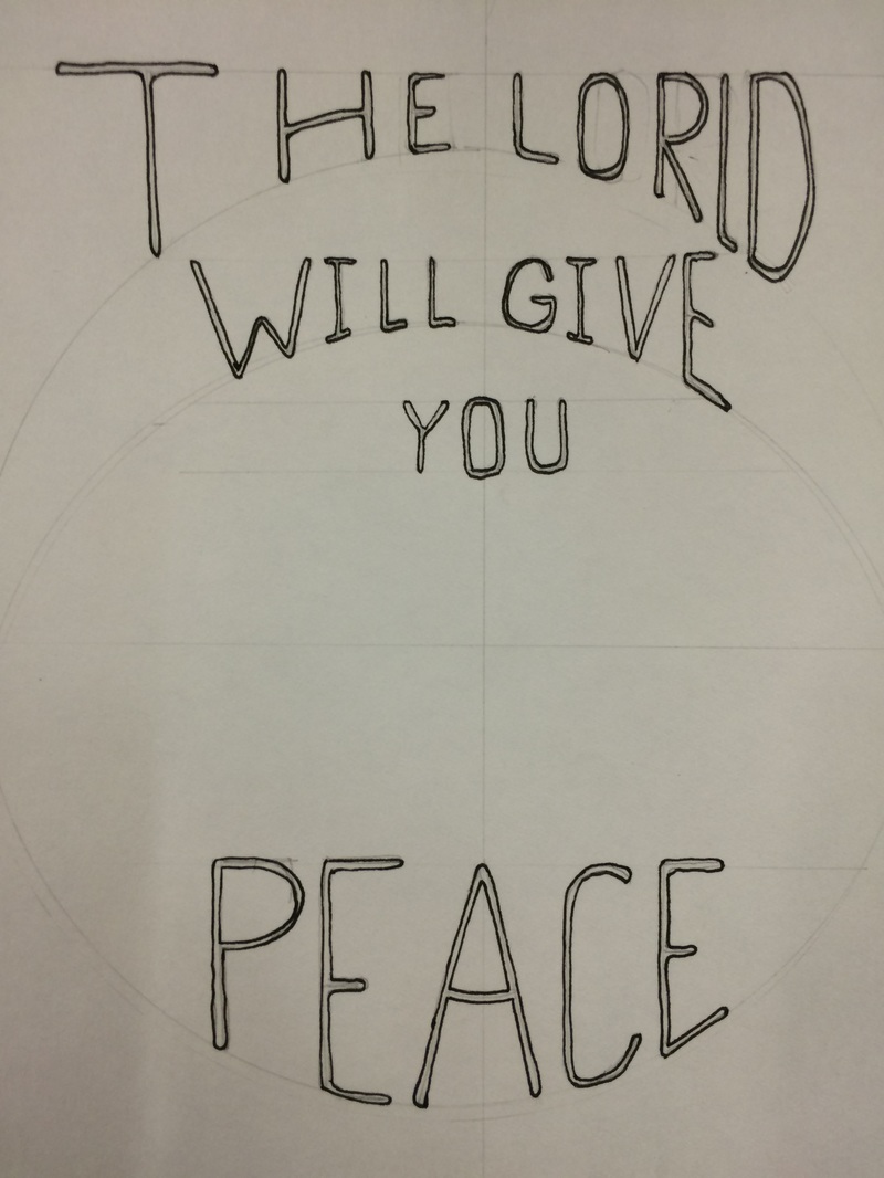
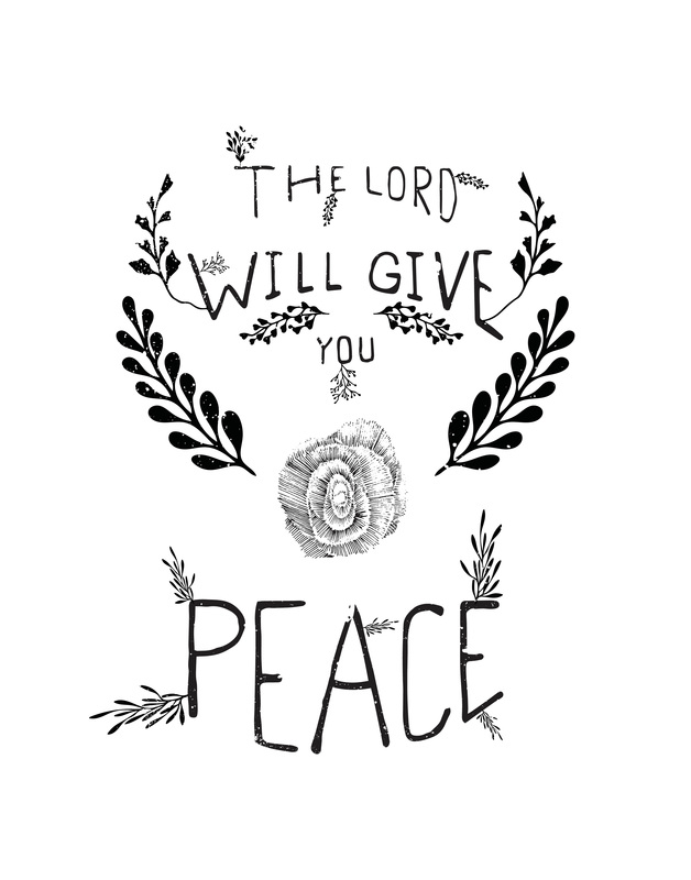
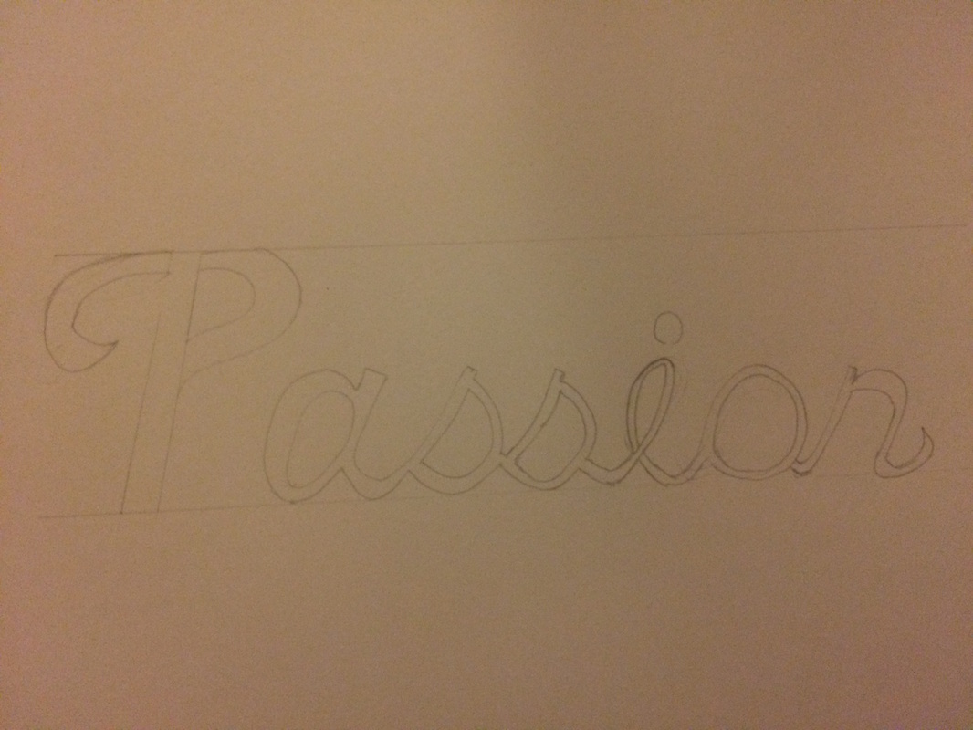
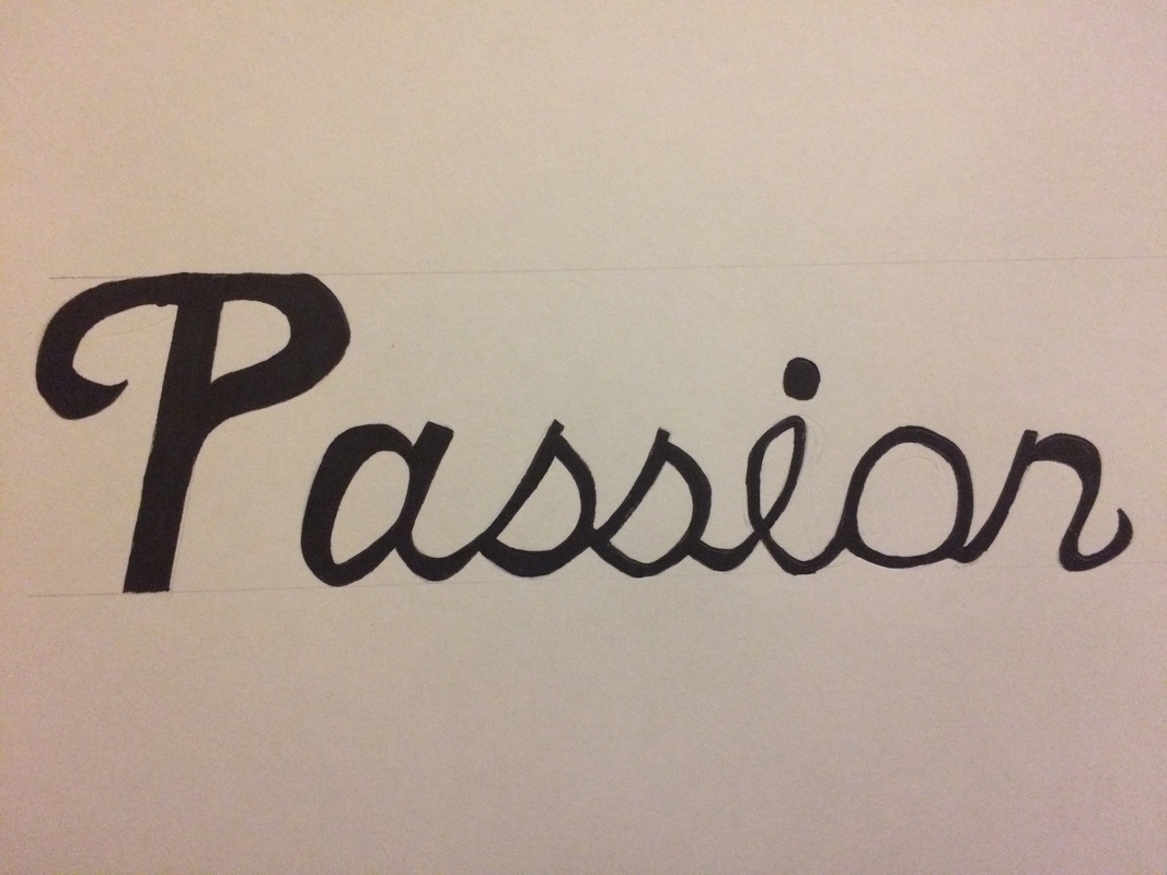
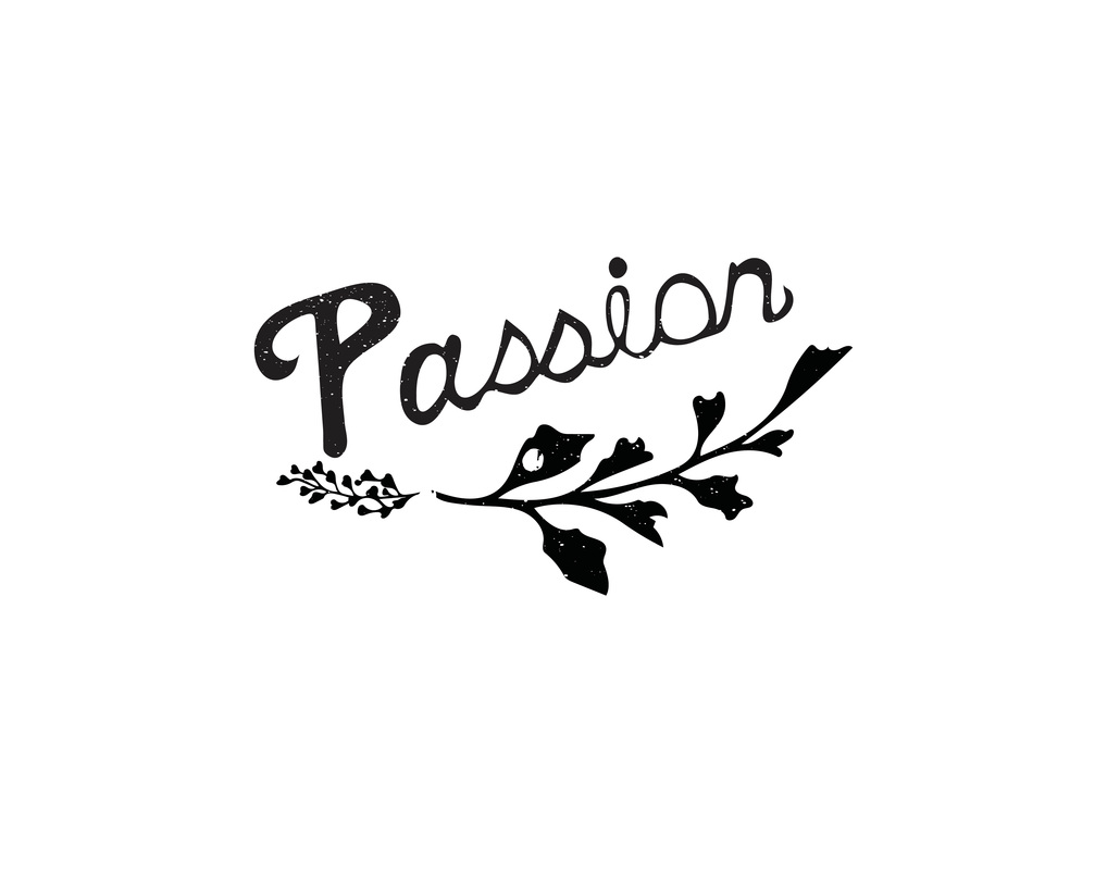
Like most other people I experience the fear of failure. Will Paterson a designer and YouTuber (that I follow) shared some great insights on failure this past week. Our last assignment in Type II was User Interface Design. We were give this awful CNN website from the O.J. Simpson trail to redesign. It's sometimes difficult to express words and emotions visually. The last assignment in Intro to Graphic Design was creating a CD cover for single. I choose Bright by Echosmith. First I did some word brainstorming, and moved onto doing a few thumbnail sketches. I got stuck a few times with where to go. None of my concepts were coming together or felt right. Then I thought of our engagement pictures and how on that day we had a beautiful bright sunset. So I used a few of the pictures as the background, and overlaid the type. The lines coming from the text represent two individuals coming together to make a love that is bright. Recently I have really enjoyed doing some hand typography projects. It's a lot of fun and a less expensive then buying fonts. A little while back I discovered William Paterson who makes hand type himself. His work is very beautiful and inspirational. Checkout his YouTube videos. These are a couple of projects I did. For some reason I couldn't spell Lord. I cough it up to working on this at 4:00 AM. So I removed the L and Added the D later in Illustrator. First I sketched out my piece with a Staedtler Mars® Lumograph® 2H pencil. Then I outlined it and filled in the type with a Pigma® Micron® 005 pen and a Staedtler® Lumocolor Permanent Broad Tip marker. After that I scanned and uploaded it to Illustrator where I cleaned it up, added the foliage, and put a splatter/grunge effect on it. I followed the same process with the Passion piece.
|
ARCHIVES
October 2018
AUTHORBrad Rowlison |

