|
In our second assignment we took the typefaces from the first assignment and redesigned a book cover with them. The book I used with Love & Respect. Akzidenz GroteskClassic RomanMashup
0 Comments
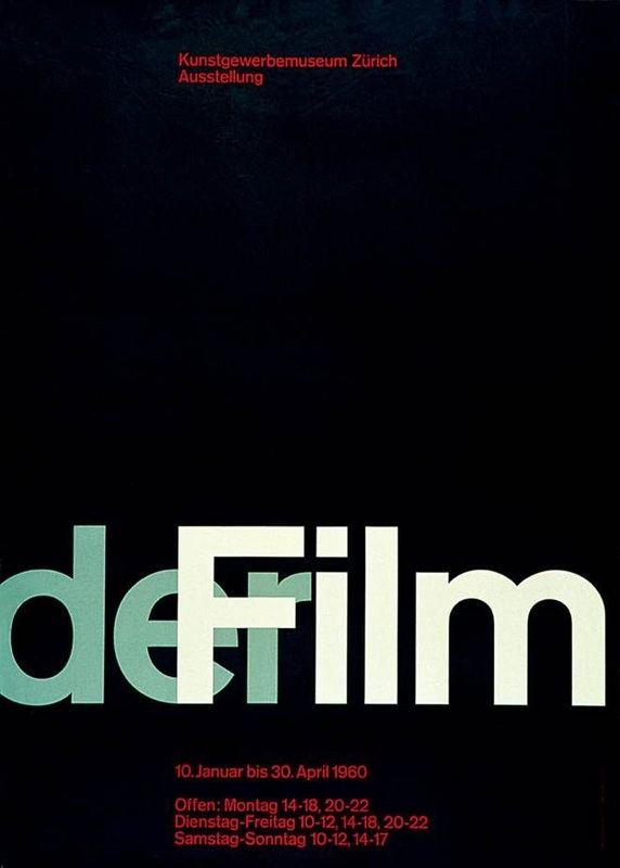
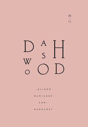
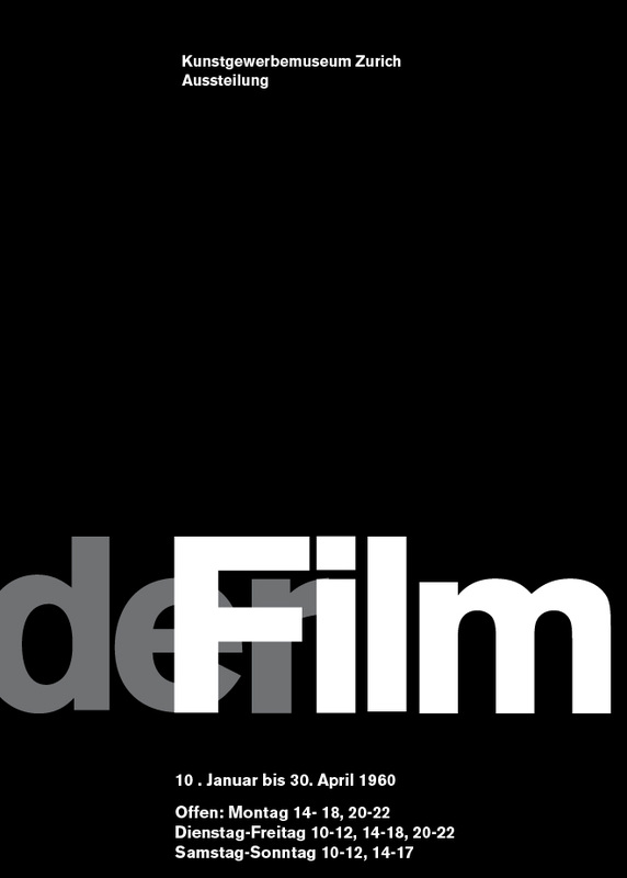
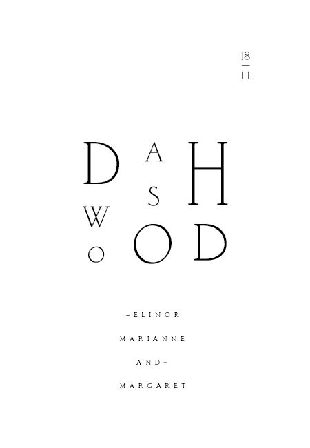
For our third assignment in InDesign Tools we did text formatting. We learned how to import text form word processors like Word and strip out all the extra unnecessary things that it puts in. Then next step was to create Paragraph and Character Styles. With these you can format the text with one click. For our first out first assignment in Typography 1 we had to emulate a design form another designer. We were given images to choose from. We had to research these designs and figure out what Typeface was being used. Here are my attempts at recreation. As you can see they are not perfect. I still need to find the exact Akzidenz Grotesk being used. Also the small text in the design on the right is not Classic Roman. It's some kind of Sans-Serif. These are the two designs that I had to work with. The one on the left uses a Typeface called Akzidenz Grotesk, and the right work uses Classic Roman.
For the first assignment in InDesign Tools we had to create a simple document with text and images. I used my Art Philosophy for the text and my logo and works for the images. This a great video we watched in Typography one yesterday. It gives a brief overview of the history of typography.
|
ARCHIVES
October 2018
AUTHORBrad Rowlison |


