blog.rowlisonart.com
  • Home
  • Main Site
  • Contact
  • Home
  • Main Site
  • Contact

#62 COMING TOGETHER

2/25/2017

0 Comments

 
I've been working on a logo for a photographer. This is an example of a mash up of two ideas. I really liked the circular badge look of the design on the left; however, the design on the right is far more proper (which is what the client was looking for) and elegant. The result was a design that kept the circular badge feel, and kept a proper / elegant look with typography and mark.  
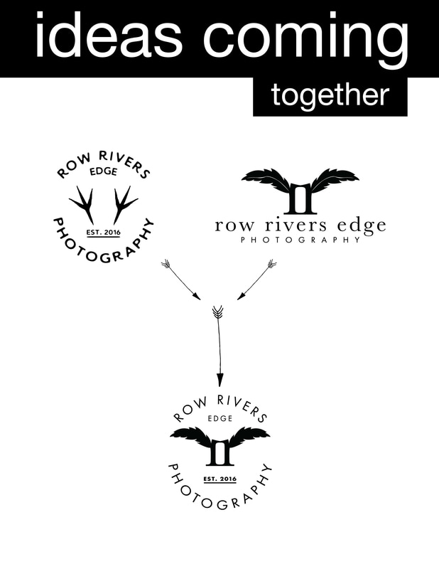
Picture
0 Comments


Leave a Reply.

    Picture

    ARCHIVES

    October 2018
    June 2018
    February 2018
    January 2018
    November 2017
    October 2017
    September 2017
    August 2017
    July 2017
    June 2017
    May 2017
    April 2017
    March 2017
    February 2017
    January 2017
    December 2016
    November 2016
    October 2016
    September 2016
    July 2016
    May 2016
    April 2016
    March 2016
    February 2016
    January 2016
    December 2015
    November 2015
    October 2015
    August 2015
    July 2015
    May 2015
    April 2015

    AUTHOR

    Brad Rowlison
    Graphic Designer &
    ​Hand Letter

Powered by Create your own unique website with customizable templates.