|
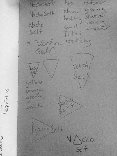
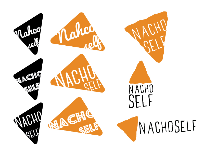
Logos were also the topic in Intro to Graphic Design this past week. We were given the assignment to design a logo for a fictitious business. My business is a self serve nacho bar called Nacho Self. I first did a few sketches and wrote down some words and colors I wanted to represent the restaurant. Starting out I went with a very geometric shape for the chip. I experimented with several typefaces. I liked the feel of the shape and a few of the typefaces, but I thought a hand drawn look may look better.
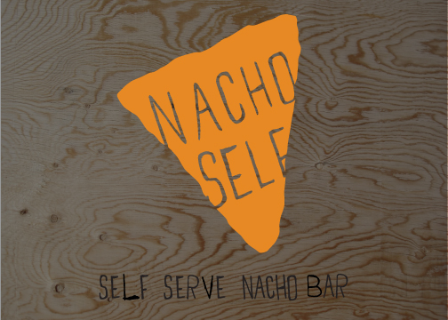
My final design with a few variations on the right is all hand drawn including the type. It gives me the hip and unique feel I wanted.
0 Comments
Leave a Reply. |
ARCHIVES
October 2018
AUTHORBrad Rowlison |


